Archive

Introduction to Motion Graphics

Today in our lesson we learned how to use stop motion as a way to produce a fresh looking animation, this has really excited me for my motion graphics piece. I want to create a sketchy sort of art animation where you see the travels of a stick man. I hope to make it quirky and entertaining, i am sure that stop motion will allow for this as this is a look i want to achieve, however I’m sure you can produce cool stick cartoon character animation through digital software, so i am going to look into trying to use Flash.

I like the whole ripped up paper collage sort of feel and with stop motion this appears to be easy to achieve. I want it to look as though it wasnt planned a sort of spontaneous story but obviously i will have to plan to make it professional. The only issue with stop motion for me is length of time and sorting out a good camera to use. However it is fairly simple. We found out about Dragon software which is like stop motion software which makes it easier to create stop motion clips, hopefully i can use this without having to pay for it, as it is quite dear in price.

My ideas are flowing and i am going to do some sketches soon!

This brief is really exciting, due to its extraordinarily open parameters for design. This has really inspired me as i can literally create any piece of animation i want and having read this i have got a solid idea. However how easy this is to execute is my worry.

As we can do what we like i have come up with a simple yet exciting idea, inspired from previous flash games i have played in the past. I want to create a sort of stick man animation, i know it sounds simple and childish, but i want to have a sort of adult humored stick man running through a world in which interacts with the audience, not physically but mentally, i want something that can create a sort of upbeat and happy vibe. My inspiration is from a game i played as a child called Fancy pants. This game has always captured my imagination, not due to its simple joys of playing but just due to how laid back the design was, it had made me create some really embarrassing stick animations on power point with a plot and story line, well i doubt you can call them animations as i was flicking through slides quickly to make them look as though they were moving.

This is fancy pants, a light hearted comical game with a creative edge second to none. The fact that it looks as though anyone could have drawn it makes it what it is. With this style i want some quirky music that just creates a brilliant feel.

This is the path i want to take to create an exciting animation that shows off my abilities and ideas and hopefully creates an entertaining piece of work. I am really excited to start it.

http://en.wikipedia.org/wiki/Knick_Knack

Having scene this short animation before and in class from pixar, its short storyline with no actual dialogue is what i like, its creative and tells a story.

This is the music that i want!

it would go so well!

Another inspiration for this sort of moving drawings is LineRider,another game i used to play from a young age, i found it very entertaining.

After finishing my motion graphics piece (with a few errors still needing to be sorted) i feel i have progressed immensely with the course. I found myself nervous about this subject as i had never attempted anything like it before, and the software was all new to me. However now i am nearing the end of the project i have found myself liking the software as it is starting to become familiar, where as before i struggled, and due to this came up with the conclusion i did not like it.

My video is pretty basic, but i feel it is effective. It works because all the words are perfectly timed with the audio, and i feel this is what makes it seem professional. I still need to sort out a few issues, and then need to sort out the rendering process so that i am able to hand it in. This should be sorted in my next lecture, and i look forward to the satisfaction of finishing the whole process.

When i had started the project i could not move or create any letters but now i can animate a whole clip with audio and well timed with relative ease. I feel that if i were left with the software for a lot longer i would be a lot better still and would enjoy it even more.

After starting my kinetic typography piece, i had a feeling it seemed a bit too boring. Therefore chats with Simon begun and we came to the conclusion that it was the background, so i searched for crinkled paper to add to the childish scribble feel of my piece. At the moment it doesnt look professional however with a bit more work i feel it will.

I found a really good piece of stock photography on deviant art. For example

This is now my background, i feel it works well with my whole childish, happy with life theme. This is how i wanted it to be.

http://maxbuch.deviantart.com/#/d1bhxvq

When we were assigned the project to create a 30 second long kinetic typography piece, about a month a go i didn’t really know what to expect as i was not sure what this would involve. I love the idea behind making a piece of kinetic typography as it generally is an exciting project. Kinetic typography is a really expressive piece of work as you can express yourself through words, but at the same time expressing the word through movement, so i feel it is really cutting edge.

When thinking about my project a few things came into my mind:

1. a song:  so displaying lyrics

2. a political speech- Barack Obama

3. A film clip- Forrest Gump

I chose to do a Forrest Gump scene as i absolutely adore the film, and i know the most about it so i felt it would be the easiest choice. Also Forrest Gump has a very unique voice and would stand out, not to forget it is such a famous film people would love it. I feel his voice would be expressed well through words.

Colour ideas- After watching the film numerous times, i felt that simplicity would be the key to this project. With a basic light blue and white i feel would suit him has a character as he is quite stupid ‘stupid is as stupid does’ therefore making it simple would be the most effective. I also saw these colours on the front cover of the dvd and feel this would be perfect.

Choosing the right clip: i had 3 different sound clips all that could be used effectively however one really stood out to me as it had two different voices behind it, as it had this official announcers voice and Forrest’s voice. This is why  chose is as it would make my piece more versatile.

Looking for the right font: I used the website: Dafont.com as a way of narrowing down the right font to use for my work. A came up with a huge selection of fonts however when trying to put them on the university computers it did not seem to work. So i found the perfect font through after effects called chalkboard. Its not to dissimilar from Comic sans however not to similar as that would be a crisis. Its perfect has a quirky comical edge but with a sense of sophistication to make it seem a bit more professional.

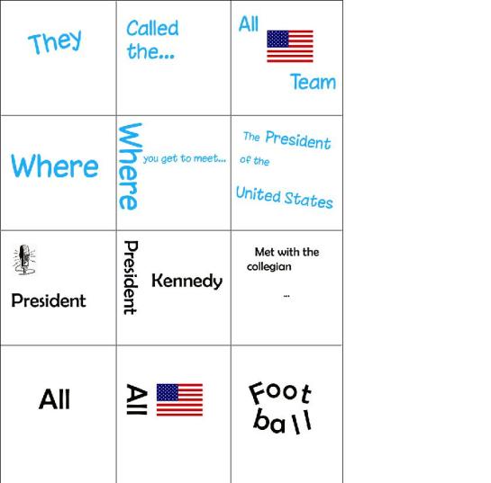
After finding a good font, i created a story board in my sketch book, with lots of ideas in to how i was actually going to create my piece. I came up with numerous ideas as a way of representing his voice in a fun and exciting manner. For example i shaped the word football into the shape of an american football, this would fly across the screen like having thrown a ball.

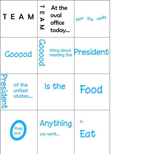
After sketching my ideas on paper, i created a grid on photoshop and created the work plan digitally scene by scene to get an idea of what it would look like. This worked well as i now have a full proof plan for when i begin my work and i now know all the words behind the video.

I am now watching numerous after effects tutorials on youtube and this has given me a few more ideas. Hopefully these tutorials will be a great help to me and my project.

Overall i feel i have a very good basis to work from, however my after effects skills are not very good yet, i need to set more time for myself to practice, as currently i find after effects very daunting and hard. But i should be able to sort this out with lots of practice.

This video is really helpful as it starts from the beginning its part of the basics which i feel will be very handy when creating my piece. I still have not got after effects yet, so tutorials are the best thing to get my head around until i get it, so that when i start my piece i will be ready. During the motion graphics  work shops Ive found myself a bit lost at times, however i always seem to understand it right at the end and sort it out. But once i get the software i feel i will become better at it, as i will be able to practice and play about.

This video explains the basics behind kinetic typography and shows how making lots of compositions can created lovely effect.

This is more advanced, but the scale move is what i am interested in and hope to do in my piece: 15:39

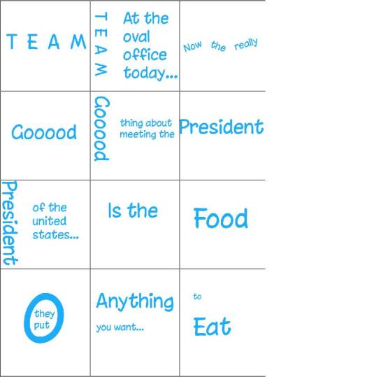
In this post i am showing you a change in font and colour for one of the characters within my clip. I feel this colour and font suit it perfectly as the announcer is very formal and informative and i felt this required a different font. Also by having this different font it allows the audience to recognize which character is which, therefore i feel this will be effective. This still remains as an idea and is not definite, i will see when creating my piece and make the decision then.

After having a vote with my housemates and classmates i feel that this clip would be the best to do, as it gives me a chance to have two different speakers within the clip in which will allow me to play about with the fonts. I also feel that this will make my piece more dynamic to that of others as it will be different. This clip does represent Forrest gump well as it has lots of humour within it. Therefore this is the clip i will use as it one i have not seen through research of other pieces and i feel it will be perfect.

These three pages  are early sketches of what my kinetic typography may look like, by doing this it will help me see what the process of creating my piece is like. It also gave me the idea of space within my piece and how important spacing is withing kinetic typography. The font is not yet secured however as i feel it does look a bit too much like comic sans although it does represent Forrest Gump quite well i feel.

This also shows me that the use of colour could be changed however i feel it work at the moment as its quite light hearted and happy which is Forrest Gump not to mention this colour does have an older feeling to it, and works well. It also showed me that i may be able to use a couple of images to get my point across,  like when there is a new speaker on the microphone within my sound clip.